
AUTONOMOUS ROBOT FLEET
OVERVIEW
Brain Corp. has the largest commercial fleet of autonomous robots in public spaces. These robots are industrial machines retrofitted with sensors transforming them into autonomous vehicles.
The purpose of the robots is to enable the user to complete other tasks while the robot takes on cleaning, delivering goods, and taking inventory.
When joining Brain Corp, my first task was to use the robots and do a Heuristic Evaluation and UX teardown. Some findings from the teardown and evaluation were: inconsistencies in fonts, language, text sizing, color usage, and icons.
ROLE
Product Design, UX Researcher
BACKGROUND

The display on the dash of the robots that the user interacts with is a 7-inch display meant to be indestructible. This hardware had some limitations, and some of the challenges I had with the hardware were: it didn't recognize gestures, multi-touch, long press, etc.
QT is the primary development language used in many autonomous vehicles Uis. There were limitations with how things were structured and coded.
PROCESS
DISCOVERY PHASE
I paired up with another designer and interviewed: management, sales associates, maintenance, inventory or stock associates, and factory workers.
We also visited some sites to observe some of the operators using the robots. There is a wide variety of users to keep in mind, a spectrum of education, backgrounds, and languages.

Some key insights from these interviews and observations were: high turnover rate, most operators didn't own a smartphone, the robots were intimidating to use, and users thought the "Robots are taking over our jobs."
After creating the personas, we came up with this problem statement and design principles:

With these design principles, our goal is to shorten the learning curve between robots so that any user can pick up and use any of our robots.
DESIGN SYSTEM
Before creating a design system, I researched design systems that use simple icons and fonts. The two that inspired me were the Olympics and the New York public transportation. Both design systems use pictograms and simple fonts and speak to a global audience. I proceeded to create a design system, icons, and visual language.
Here are a few icons for the buttons, the machines or robots, and the machine components.

Next, I had to get buy-in from stakeholders within the company (Product managers, developers, and marketing)
as well as our OEM partners. It was not an easy task to get people to agree to significant changes.
I explained that this would save development time, create consistency and trust for our operators, and scale across all the products.
USABILITY IMPROVEMENTS

I adjusted the workflow to help users complete their tasks and reduce usability issues and frustration. After adjusting the workflow I created wireframes.
DESIGN & TEST
My next task is to design all the screens and present them to the stakeholders to get buy-in. Before implementing the designs, a designer and I went to a local Walmart to test the prototype with users. We ran into some minor usability issues and iterated on the design.

DEVELOPMENT
Partnered with the development team to implement the designs and roll out the design system in software releases. Later we used the design system and implemented it in the other robot types.

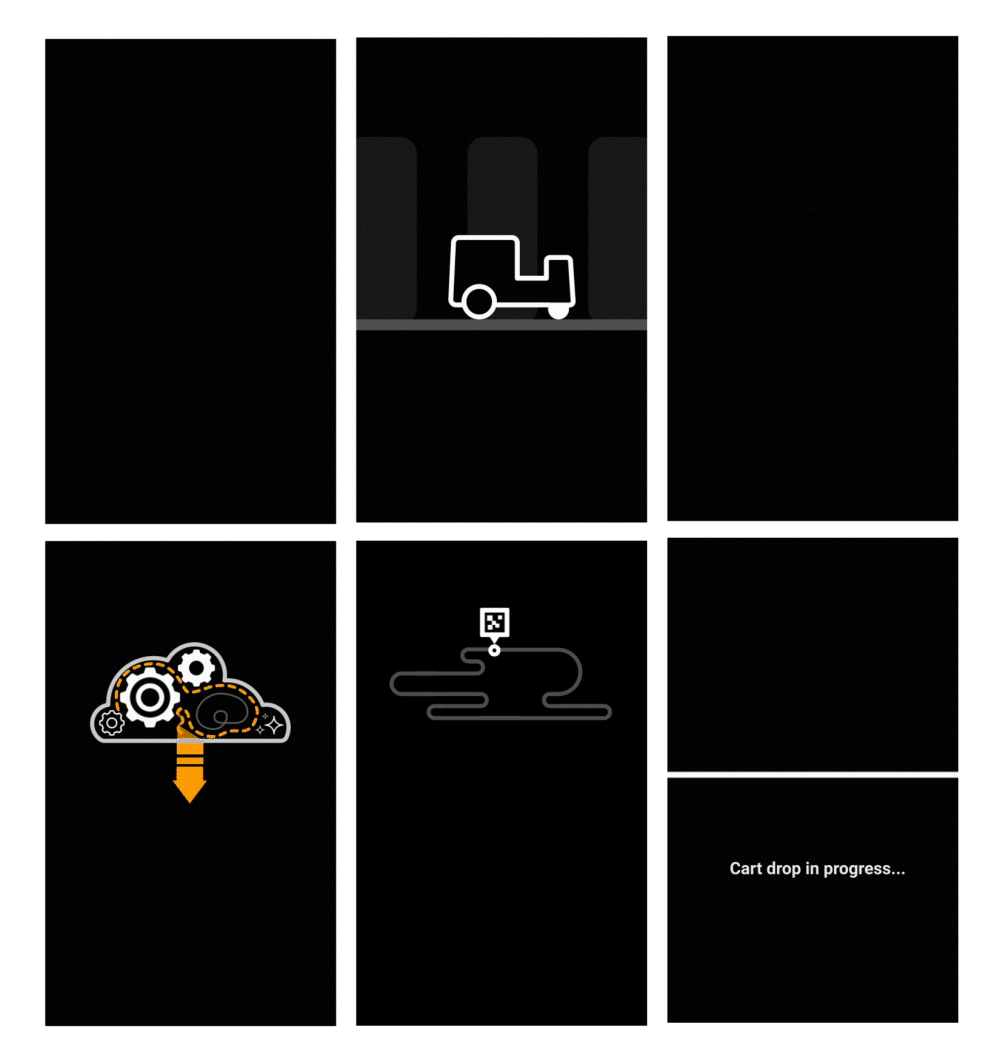
ADDING PERSONALITY
I learned how to use Lottie to create these animations. Here are some example animations for when the UI is booting up, when the robot is saving routes, and when the robot is giving the operator daily maintenance reminders, hoping to make our robots a little more approachable.